Dashboards should do one thing really well: give you the right insight at the right time so you can act. If your ERPNext dashboard feels crowded, irrelevant, or confusing, you’re not alone. Many teams accept “default” dashboards and miss out on faster decisions, better accountability, and real-time control.
This guide shows you how to customize ERPNext dashboards that are simple, focused, and powerful. No jargon, no fluff, just practical steps, real examples, and best practices you can use today.
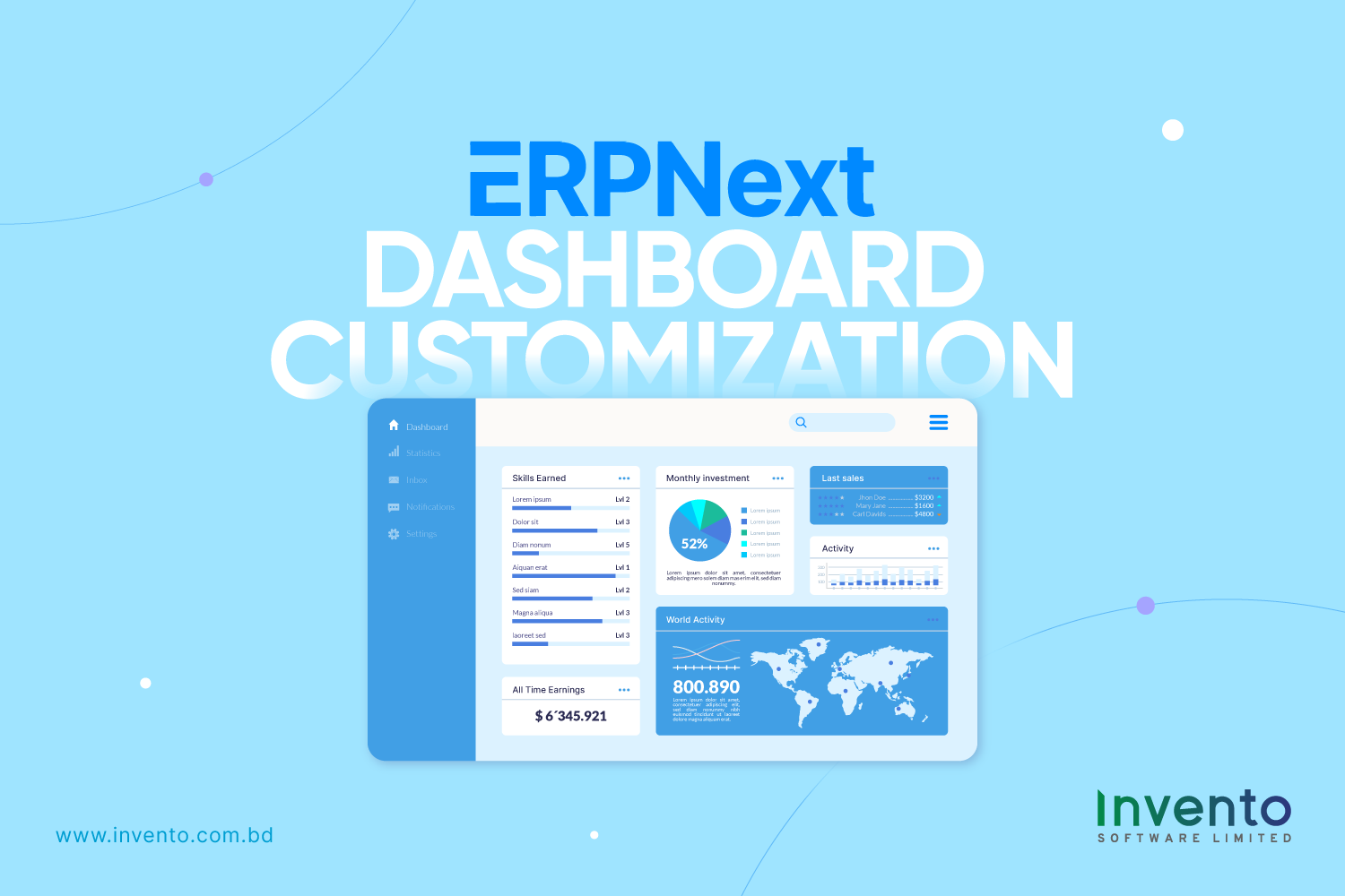
Why Dashboard Customization Matters
Default dashboards are a starting point, not the destination. They bundle generic widgets to cover many use cases at once. That makes them useful for exploration but weak for day-to-day decisions.
A customized dashboard focuses attention on the metrics and actions your team actually needs. When you show the right KPIs in the right place, people stop hunting for information. They make decisions faster, with fewer mistakes.
You can prove value in numbers. Track a few simple measures before you change the dashboard, then measure again after the rollout. That makes the benefit concrete and repeatable.
Key metrics to track (examples):
- Adoption Rate = unique dashboard users ÷ total intended users.
- Time-to-Insight = average time from starting a query to having a decision-ready data point.
- Action Rate = actions taken from the dashboard (approvals, orders, follow-ups) ÷ dashboard views.
Instrumenting these metrics is straightforward. Log dashboard views, clicks on drill-downs, and timestamps for the first and last interaction in a session. Use that data to calculate baselines and set targets. For example, measure Time-to-Insight for a week, implement a role-specific dashboard, and measure again to see real change.
Customization reduces common friction points. Users open fewer reports, spend less time in status meetings, and escalate issues later or not at all. When dashboards put context next to a metric (trend, target, and call-to-action), teams act immediately instead of pausing to check sources.
A Step-by-Step Customization Workflow for ERPNext Dashboards
Customizing dashboards should be methodical. Following a structured workflow ensures the dashboards are actionable, easy to read, and highly useful for your team.
1. Define the Decision
Start by clarifying what decision the dashboard should support. Identify who will use it and how often.
A clear purpose ensures the dashboard shows only relevant data. It avoids clutter and helps users focus on what matters.
Example: For a procurement manager, the dashboard might help approve pending purchase requests on a daily basis. Knowing the decision narrows the scope of KPIs and visuals you need.
2. Pick the KPIs
Choose only a few key metrics that directly influence daily actions. Keeping the number small, typically three to six, ensures the dashboard is focused and readable.
For example, a procurement dashboard could track: open requests, average approval time, purchase orders created, and spend versus budget. Every metric should provide actionable insight. If it doesn’t guide a decision, it doesn’t belong on the main view.
3. Choose Visualization Types
Select visual formats that make data easy to understand. Line charts work well for trends, bar charts for comparisons, and KPI cards for single values or alerts. Gauges or colored indicators can show progress toward targets.
Avoid overly complicated visuals. Simplicity improves clarity and helps users act quickly.
4. Arrange by Priority
Place the most important items where users naturally look first usually the top-left or center of the screen. Supporting charts, tables, or details can go below.
For instance, KPI cards showing open requests, average approval time, and budget status should appear first. Trend charts and detailed tables can be positioned after the top-priority metrics. This layout guides attention to critical information immediately.
5. Add Contextual Cues
Every metric should include context to make it meaningful. This can include the time range, targets, trend indicators, or a short insight explaining anomalies. Adding a brief action suggestion helps users act immediately.
For example, a KPI card could display: “Average Approval Time: 18 hours (−20% vs last week). Target: <24 hours. Action: Review requests older than 24 hours.”
6. Provide Drill-Downs
Link summary cards directly to underlying reports or forms. This allows users to act without searching elsewhere in ERPNext.
For example, clicking on “Open Requests” could open a filtered list of pending requests, or a trend chart point could show requests for a specific date. Drill-downs save time and make dashboards actionable.
7. Test and Iterate
Start with a pilot group before rolling out to the entire team. Collect feedback and refine the layout, KPIs, and drill-downs.
Track key metrics such as adoption rate, time-to-insight, and action rate. Use the feedback to improve usability. Iteration ensures the dashboard aligns with real workflows rather than theoretical designs.
8. Maintain Alignment with Business Needs
Dashboards are dynamic. Regularly review them to ensure KPIs remain relevant, performance is acceptable, and all alerts and targets match current business goals.
Periodic updates and audits ensure dashboards remain practical, actionable, and aligned with your organization’s objectives.
Role-Based Dashboard Examples
Different roles need different windows into the system. Here are practical examples you can replicate in ERPNext.
Sales Manager Dashboard
Show open opportunities, monthly revenue vs target, top 5 deals closing this month, and average deal age. Include a quick link to create follow-up calls.
Inventory Manager Dashboard
Surface low-stock items, incoming purchase orders, daily stock movement, and items with long lead times. Add reorder suggestions and direct links to supplier purchase pages.
Project Manager Dashboard
Display active projects, overdue tasks, hours logged this week, and budget consumption per project. Attach quick links to timesheet approval and task creation.
Finance Dashboard
Show cash balance, overdue invoices, monthly burn rate, and expense approvals pending. Provide shortcuts to bank reconciliation and invoice creation.
Each dashboard should be role-specific, short, and action-oriented.
What Makes a Dashboard Perfect
A great dashboard answers questions fast. It tells you what matters right now, what needs immediate attention, and what has changed since yesterday. Every glance should offer clarity, not confusion.
The best dashboards are built on three principles: clarity, relevance, and speed.
Clarity beats cleverness. Keep visuals simple and intuitive. Avoid overly complex charts that slow understanding or distract from insights. The goal is not to impress with design, but to inform with precision.
Relevance beats quantity. More metrics don’t make a dashboard better they make it harder to read. The right few data points, chosen carefully, give sharper focus and faster action. When every chart has a reason to exist, teams stay aligned on what really matters.
Speed beats complexity. Dashboards should load fast and respond instantly. Lagging interfaces or cluttered layouts can cost valuable seconds in decision-making. In high-performing organizations, speed is more than convenience; it’s a competitive advantage.
According to McKinsey & Company, companies that use analytics intensively outperform their peers in key business areas. They are significantly more likely to win new customers and improve overall profitability.
This link between analytics and performance is not accidental. It comes from giving people clear, timely access to insights, exactly what a well-designed dashboard delivers.
Today, many organizations are rethinking how they manage data and analytics. With the rise of AI, automation, and real-time data streams, dashboards have evolved from static reports into living command centers. They must help teams see patterns, act instantly, and adapt continuously.
How to Measure Dashboard Success
How do you know if your dashboard is truly working? The answer lies in tracking both quantitative and qualitative signals that reflect real user behavior and business impact.
A dashboard isn’t successful just because it looks appealing, it’s successful when people use it, act on it, and make better decisions because of it.
1. Adoption
Start by measuring how often users access the dashboard. A well-designed dashboard becomes part of a team’s daily routine, not an occasional reference. If adoption is low, it’s usually a sign of poor relevance or usability.
Set a clear benchmark, for example, 80% of targeted users logging in daily or weekly. Track progress through ERPNext usage analytics or activity logs.
2. Action Rate
Great dashboards drive action, not just observation. Track how often users respond to the dashboard’s insights or calls-to-action, such as approving invoices, creating purchase orders, or resolving flagged issues.
A rising action rate means the dashboard is doing its job, turning information into outcomes.
3. Time Saving
Time is a direct measure of efficiency. Evaluate how long it takes for users to find key information before and after the dashboard launch.
For example, if managers previously spent 15 minutes gathering order data manually and now find it in 2 clicks, that’s tangible ROI.
Collect this data through short user surveys or workflow tracking tools in ERPNext. Even small time savings compound across departments, improving overall productivity.
4. Decision Impact
Finally, assess whether decisions are faster or better because of the dashboard. Look for signs like reduced approval delays, fewer escalations, or improved forecast accuracy.
You can also compare performance metrics, for instance, lead times, fulfillment rates, or profit margins, before and after dashboard implementation.
Governance and Data Security
Dashboards are only as trustworthy as their data. Establish clear ownership for data sources and transformation logic.
Document the origin of each KPI: which report, which filters, and any calculations applied. Keep a change log for dashboard modifications and report schema changes.
Implement a lightweight governance process: define who can create dashboards, who reviews them, and how frequently they must be validated. Periodically archive or consolidate outdated dashboards to avoid clutter.
Regular audits, especially after major system updates or data model changes, prevent silent drift in reported numbers.
Final Comment
A well-customized ERPNext dashboard turns raw data into clear decisions. It helps teams see what matters, act faster, and stay aligned with business goals.
The best dashboards aren’t static; they evolve with your processes. Keep refining metrics, layouts, and visuals as your needs change.
At Invento Software Limited, we believe a smart dashboard doesn’t just display data. It drives action. When your team can see what’s happening in real time, they can focus on what to do next.